Teams Sign-up Onboarding Redesign
Turned a broken onboarding flow into a conversion machine.
Evernote's Teams sign-up process had been unchanged for 4 years, as priorities moved to other parts of the platform. Because of this, only 25% of Admins who started the onboarding flow, actually completed it. The only thing keeping this experience together, was the Customer Support team stepping in to band-aid the experience by providing white-glove support for the Admin, that was costly for Evernote, and not scalable.
Process
- 1Mapped the full user flow to identify drop-off points across 5 onboarding steps
- 2Ran unmoderated user testing with 13–15 participants per phase using prototype variants
- 3Conducted competitive analysis across 8 SaaS onboarding flows
- 4Consolidated the 5-step signup into a single step by combining fields and deferring non-critical inputs
- 5Redesigned the checkout flow — adopted platform-wide after strong test results
- 6A/B tested plan picker variants and device sync interaction patterns
Hypothesis / Goal
By simplifying sign up, improving the commerce flow, and making the experience more self-service, Admins will complete the onboarding steps faster, and invite more teammates, leading to increased conversion.
Step 1: Create a User Flow of the Full Onboarding Experience
I used this to work with the CS team and Data analyst to identify the pain points CS and Admins were having.
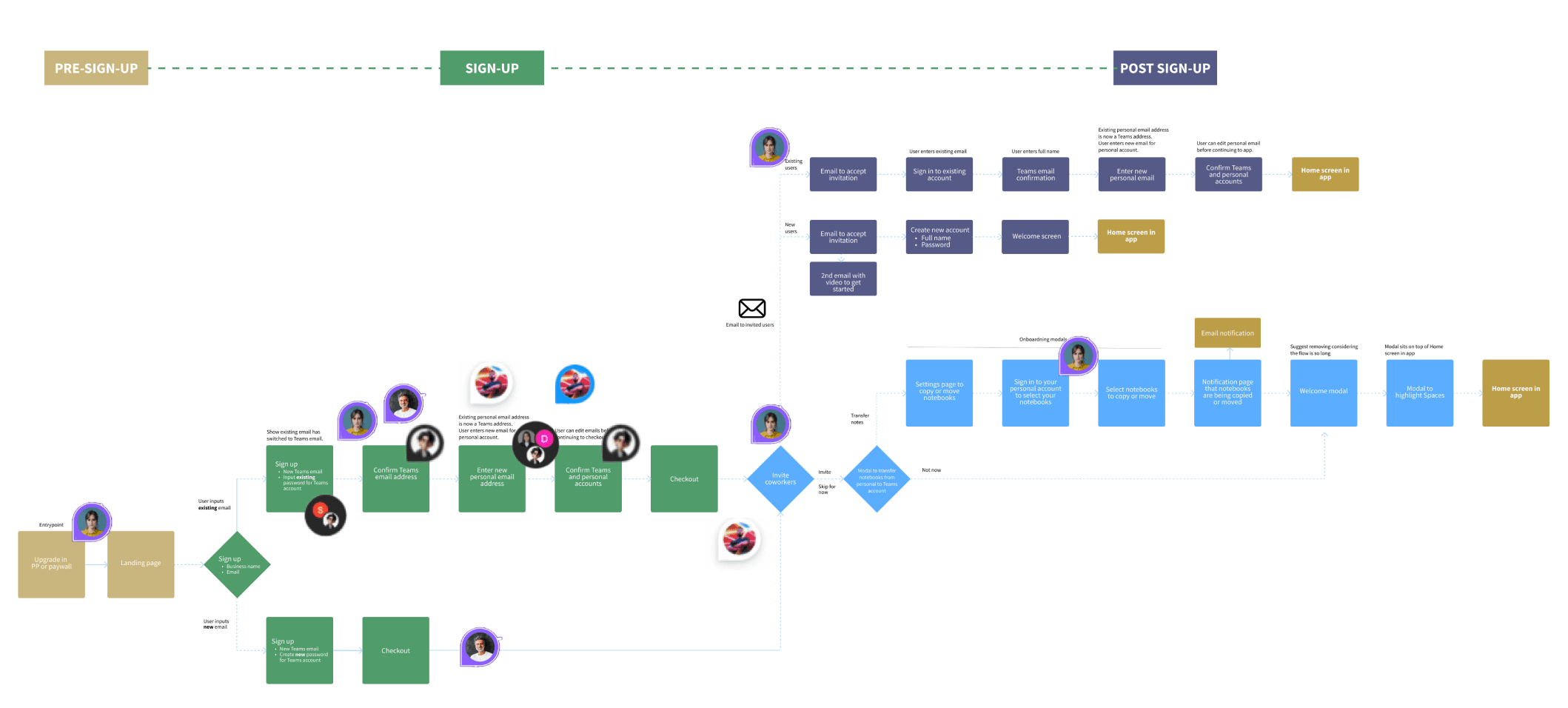
Zooming into the sign-up section, there were two paths for sign-up, depending on whether the Admin used an existing email from their Personal plan on Evernote, or a new email. These different paths added a lot of friction, specifically for an existing email.
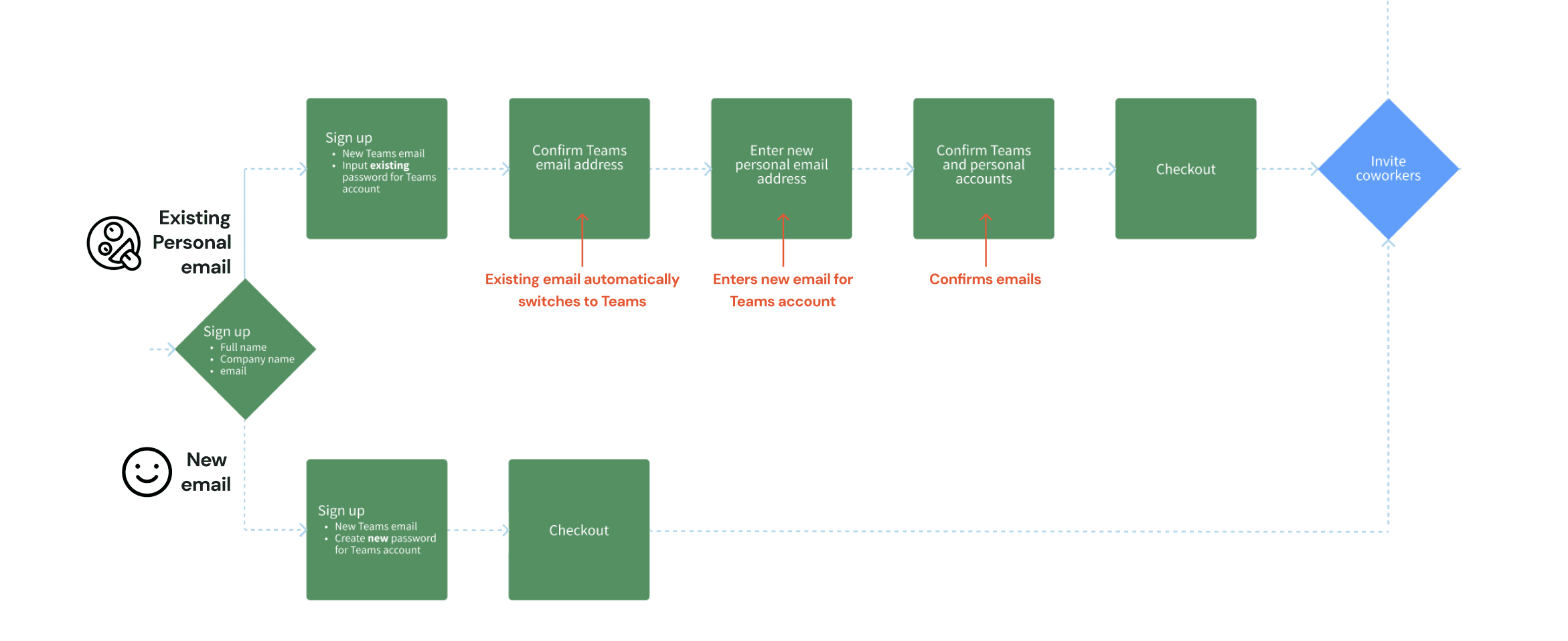
Working with Eng, we found a way to have the existing email behave the same way as the Personal plan email, which shortened the flow significantly for both use cases. I also combined all of the sign-up fields into one screen, and let the Admin invite coworkers BEFORE they checkout.
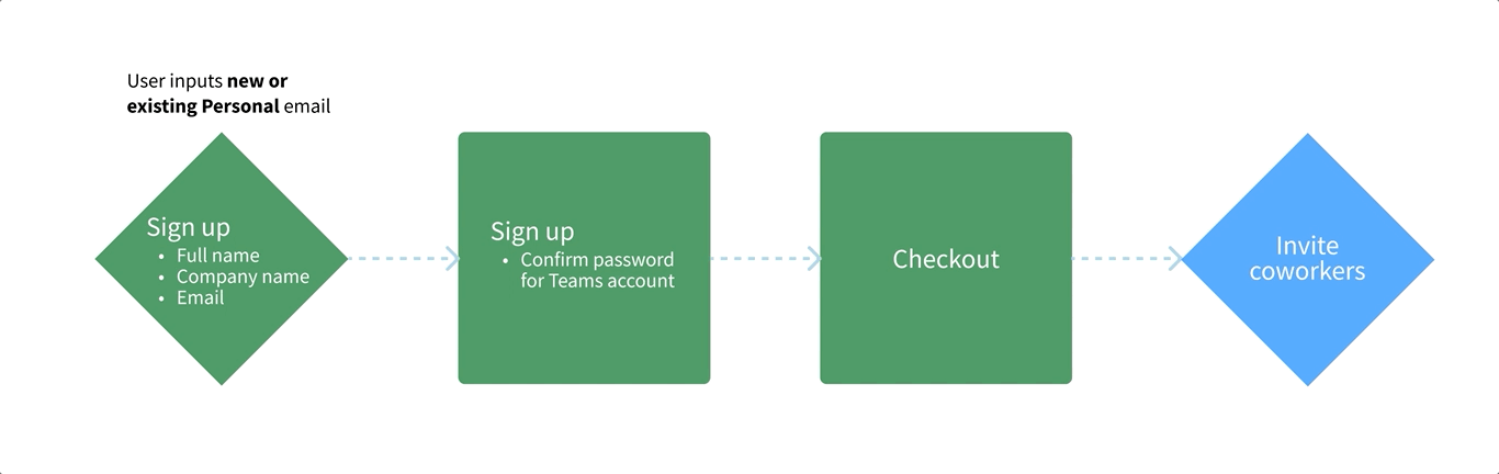
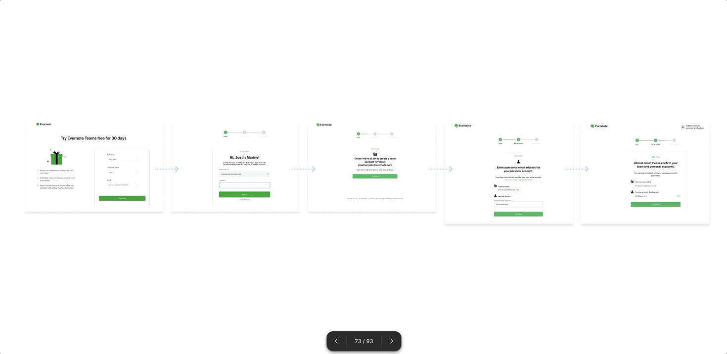
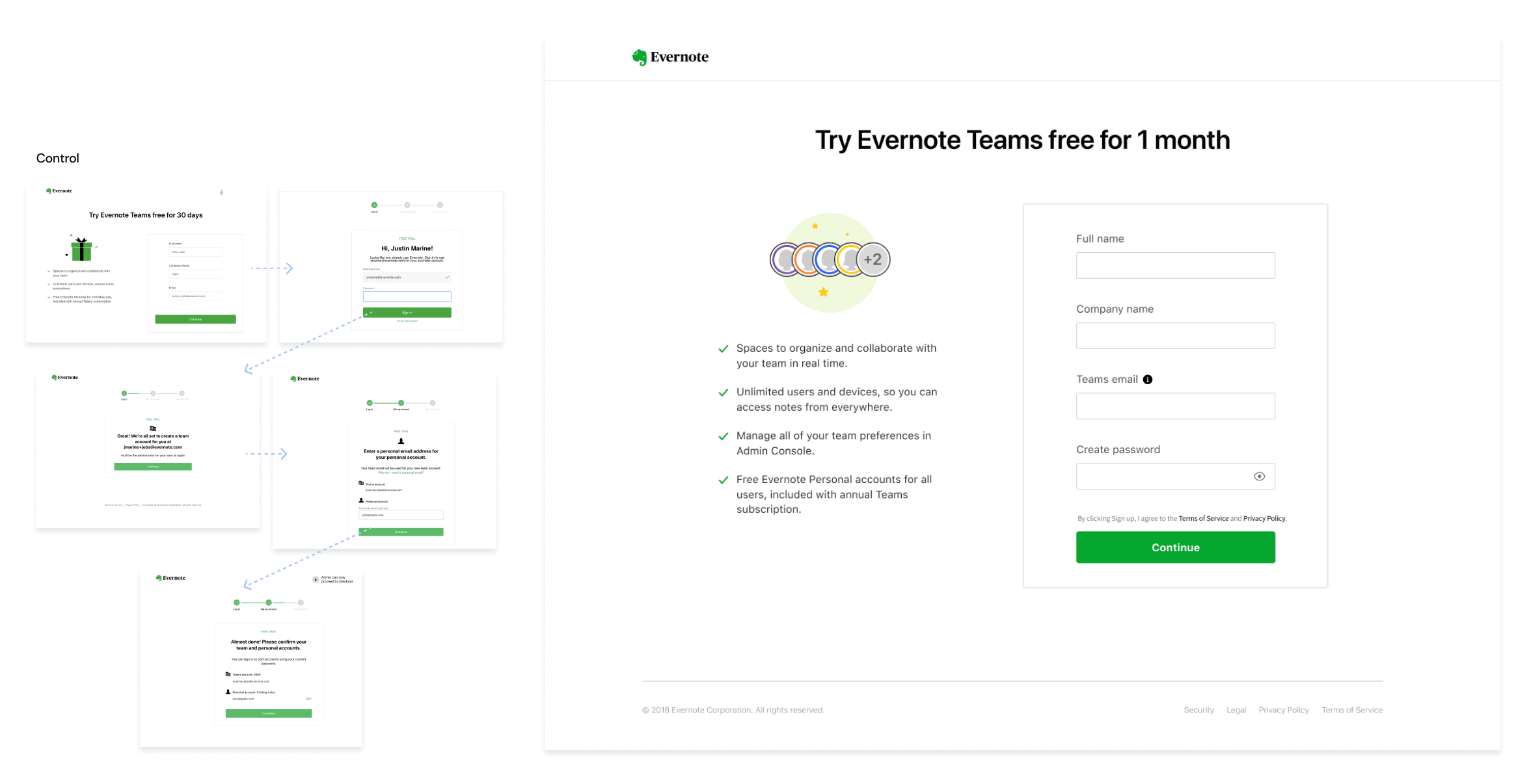
This was the current sign-up flow with Five steps.
Step 2: Research
Conducted unmoderated user testing with 9 users on the Personal plan, and 4 users that had never used Evernote, to go through a prototype I created of the current experience while we recorded them.
Step 3: Design
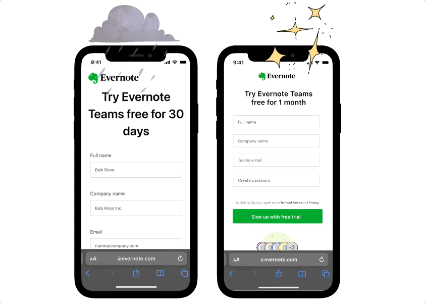
After learnings from user testing, I designed many concepts, reducing all five steps into one step.
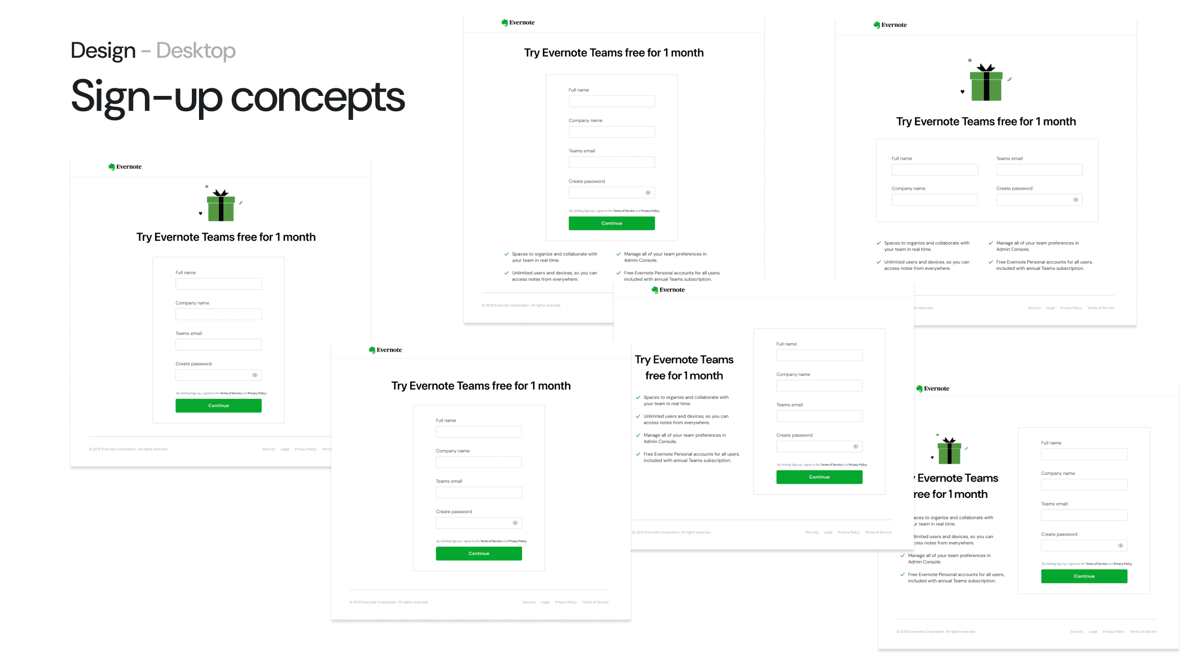
After user testing concepts, along with multiple design reviews, we narrowed the options to this 1 sign up page.
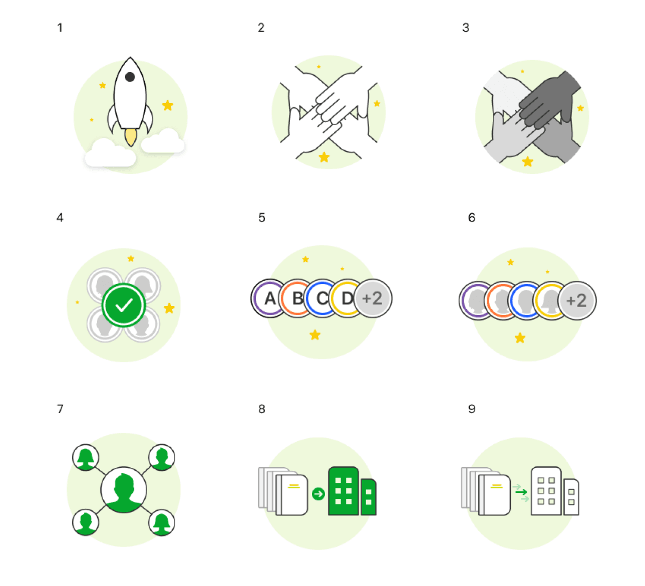
Here are examples of other illustrations I designed to communicate boosting productivity for work, and inviting coworkers to collaborate.
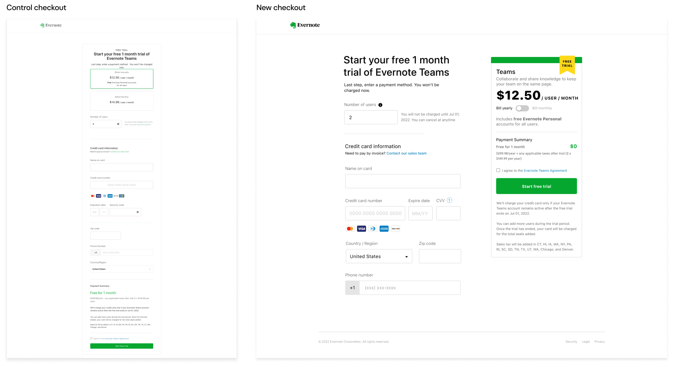
The current check out page on the left was an endless scroll, that went far beyond the fold. Working with Commerce team, I redesigned the experience to ensure everything was above the fold, with better hierarchy. This design proved to be so successful that commerce adopted it across the entire platform.
Mobile
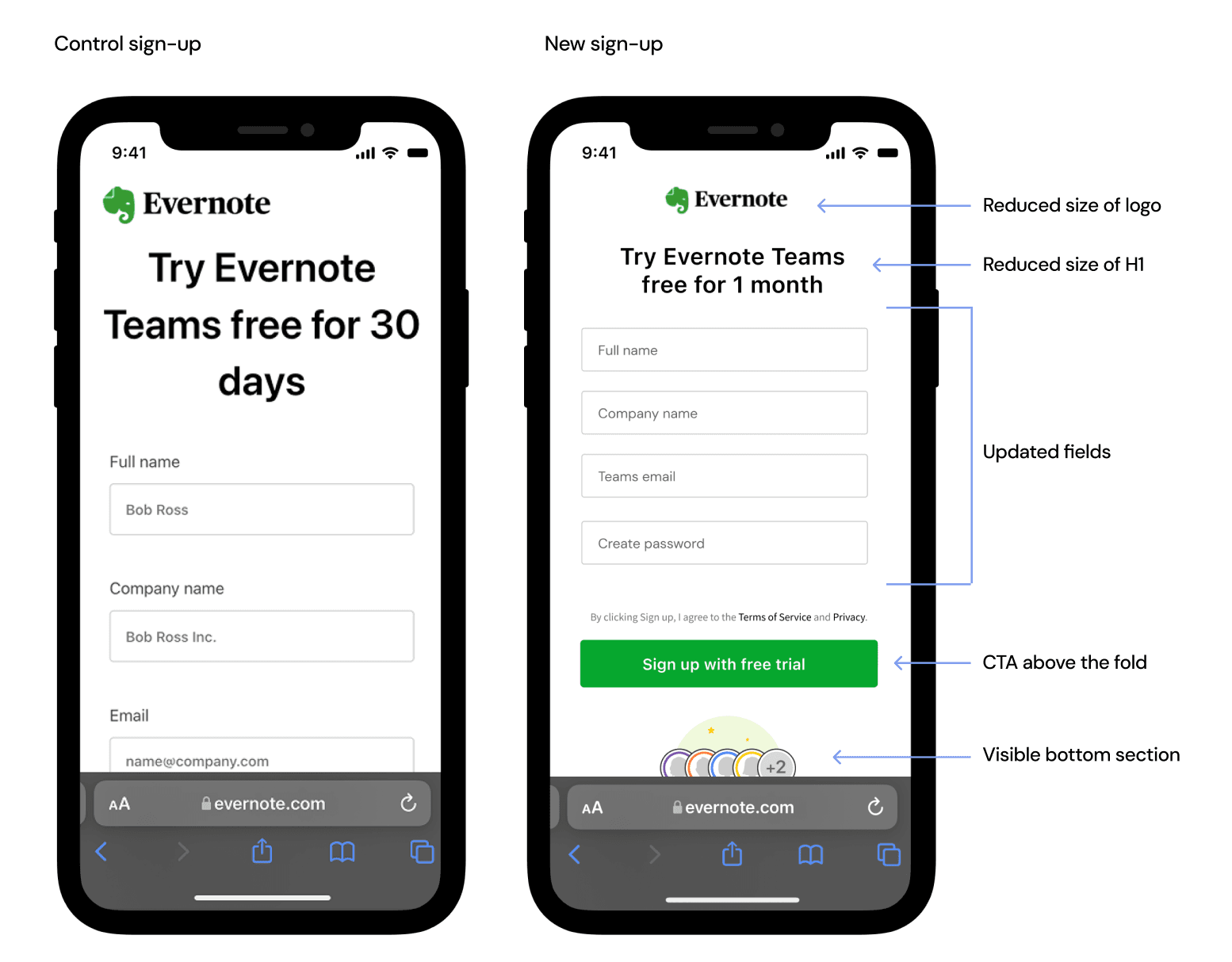
To bring the sign-up form and CTA above the fold, I reduced the logo and H1, worked with the Design systems and Commerce team to put labels in the fields to reduce the height, as well as reduce line height between each field. I also stress-tested the bottom section to ensure it be visible across smaller devices.
💰 The Impact
$38K
Increased Revenue Over Control
+18%
Admin Invitations
-30%
Admin's Needing Customer Support

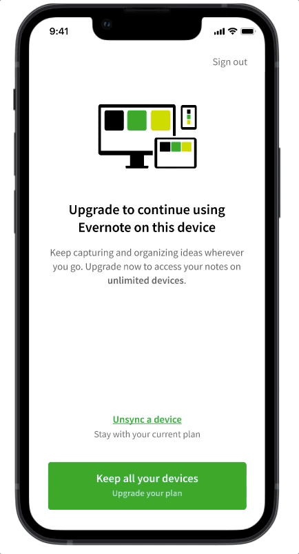
Device Sync Paywall — Context
Users on the Free plan can sync up to 2 devices, but when they try to sync a third device to their account, a paywall modal is triggered to let them know they have to either upgrade to a paid plan to continue syncing a third device, or unsync one of their synced devices to continue.
Problem
The unsync device flow was confusing with messaging, hierarchy, illustration, and general poor experience, which frustrated the user trying to continue using Evernote.
Hypothesis / Goal
By creating a better experience that is clear to the user how to unsync a device in order to continue with Free plan, and more importantly upgrade, the user will have higher confidence in the app, and by proxy increase conversion by 4% on this screen.
Step 1: User Test Current Experience
Reactions from participants:
- Upgrade link in Select devices screen didn't look clickable
- Upgrade button in Device selection screen was a different UI as previous screen
- Illustration didn't communicate unsyncing
- Copy is confusing
Step 2: Iterate on Multi-select Interaction
Explore different multi-select patterns, based on competitive analysis and usability best practices.
Step 3: Iterate on Upgrade CTA Pattern
Explore different upgrade CTA styles that are more explicit than what was currently in production.
Step 4: Iterate on Illustration
Explore different illustrations that communicate being blocked on syncing another device.
Step 5: User Test Prototypes
After narrowing down designs with team, I created a clickable prototype to user test against the old flow with Free users.
Step 6: Synthesize Research
After conducting an unmoderated user test with 15 participants, I worked with the Researcher to synthesize the feedback to not only validate our hypothesis, but look for negative feedback that could help inform any design changes.
💰 Final Results
By creating a better experience for users to unsync their devices, it gave them more confidence and trust in Evernote, which by proxy led to a 9% lift in conversion on this screen.