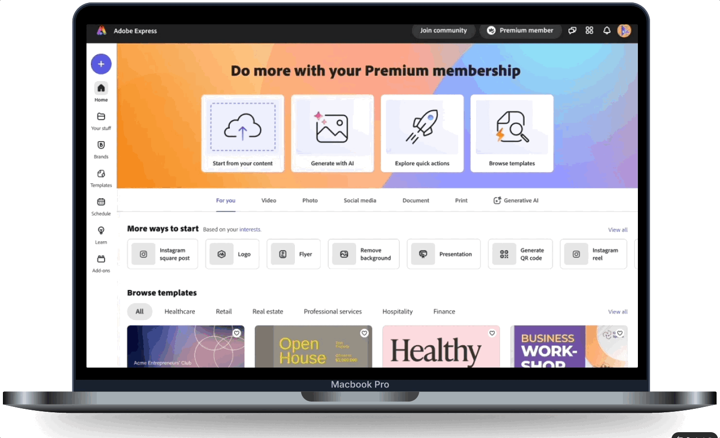
Premium Member Hub
Helped Premium users discover the features they're already paying for.
Premium Member Hub is a permanent placement in the app, where Premium users can see what premium features come with their plan, learn how they work, and take action to achieve their goal. I discovered and led this project from end-to-end.
Process
- 1Analyzed data science metrics to identify the engagement gap between trial and paid users
- 2Conducted user testing on the control design — users reported: 'Feels like I'm being asked to upgrade again,' 'Too much copy,' and 'Generally not helpful'
- 3Explored 3 design concepts: minimal content card, dropdown panel, and a modal experience
- 4User testing validated the modal approach for discoverability; refined hierarchy and reduced copy
- 5Built V2 with personalization layer, usage history, and motion design to demonstrate features
The Problem
These metrics tell us that the more paid users engage with premium features, the longer they remain on the platform. The problem is, only 68% of users engage with premium features.
82%
Paid members that use Premium features after 90 days, are still active
68%
Paid members don't use Premium features
The Opportunity
The more premium features a paid member uses between desktop and iOS, they convert at a higher rate the longer they use them. This chart (along with others from Data Science), helped inform why and what to design.

The Hypothesis
By more clearly showing users what our Premium plan includes, outside of our paywalls, we can improve Premium value discovery, and drive higher trial-to-paid conversion.
User Testing — Control Design
We tested the existing design with users before designing anything new. The feedback was consistent:
“Feels like I'm being asked to upgrade again”
“Illustration isn't inspiring”
“Too much copy”
“Generally not helpful”

The Concepts
Concept 1
- ✓Minimal content to reduce friction
- ✗Not scalable when adding more content
Concept 2
- ✓More content, but keeping it a dropdown to reduce friction
- ✗Getting closer, but still not enough room to scale
Concept 3
- ✓Modal provides better focus
- ✓Modal preferred over dropdown in user testing
- ✗Creates more friction
User Flow

The Final Designs
- Reduced copy
- Added premium color background to visually connect hub with plan
- Introduced new 75:25 ratio grid for better hierarchy and differentiate from paywall
- CTA's for actionable guidance. Hover animations communicate what each feature does

🚀 Impact
$165K
Annual Recurring Revenue
+33%
Used Premium Content at Higher Rate
+8%
Trial to Paid Conversion
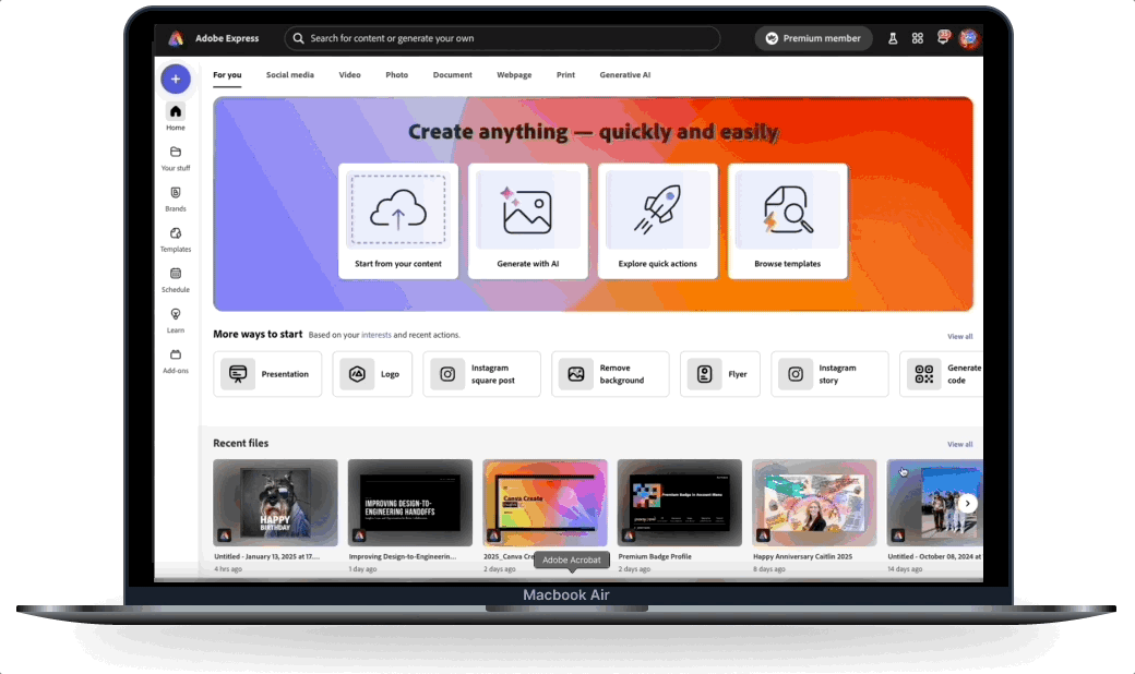
Next Steps — V.2 Premium Hub
With learnings from the new Premium Hub, I designed a more immersive, personalized and holistic experience to help users better understand what they have, what they've used, and what we recommend to help guide them to that experience quickly.

Driving More Traffic
Worked with Home team and Motion designer to create another touch-point with a delightful animation.