Context:
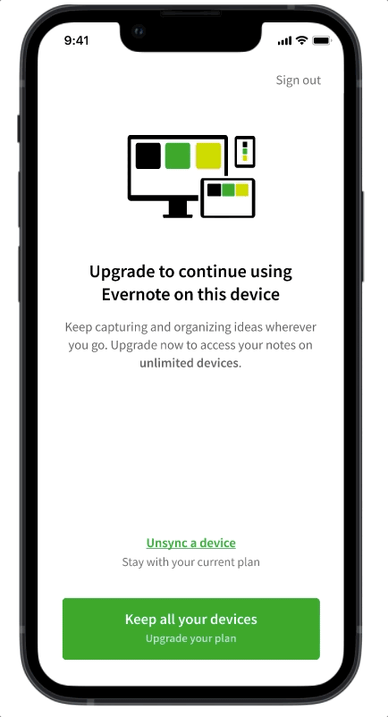
Users on the Free plan can sync up to 2 devices, but when they try to sync a third device to their account, a paywall modal is triggered to let them know they have to either upgrade to a paid plan to continue syncing a third device, or unsync one of their synced devices to continue.
Problem:
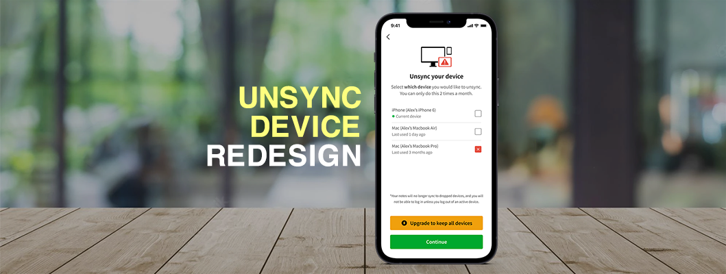
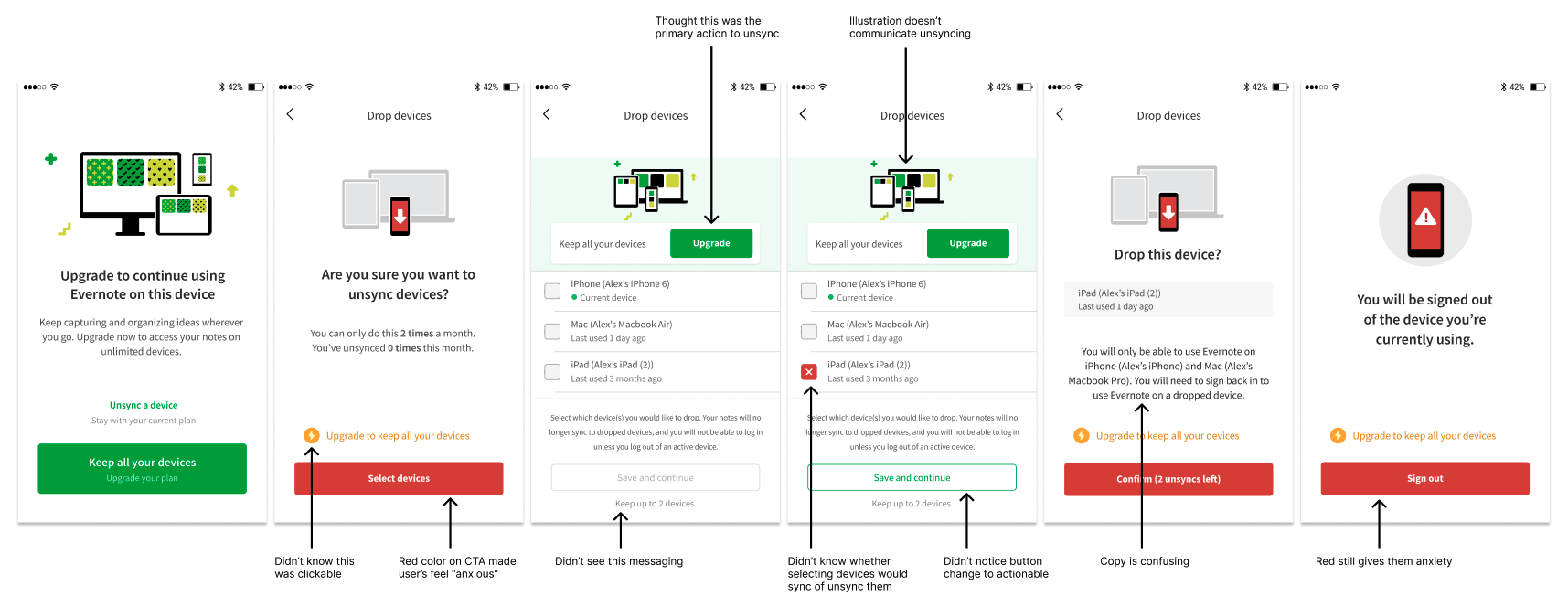
The unsync device flow at the time was very confusing with messaging, hierarchy, illustration, and general poor experience, which frustrated the user trying to continue using Evernote.
Hypothesis/Goal:
By creating a better experience that is clear to the user how to unsync a device in order to continue with Free plan, and more importantly upgrade, the user will have higher confidence in the app, and by proxy increase conversion by 4% on this screen.
Step 1: User test current experience
Worked with our Researcher to understand the pain points our users are having.
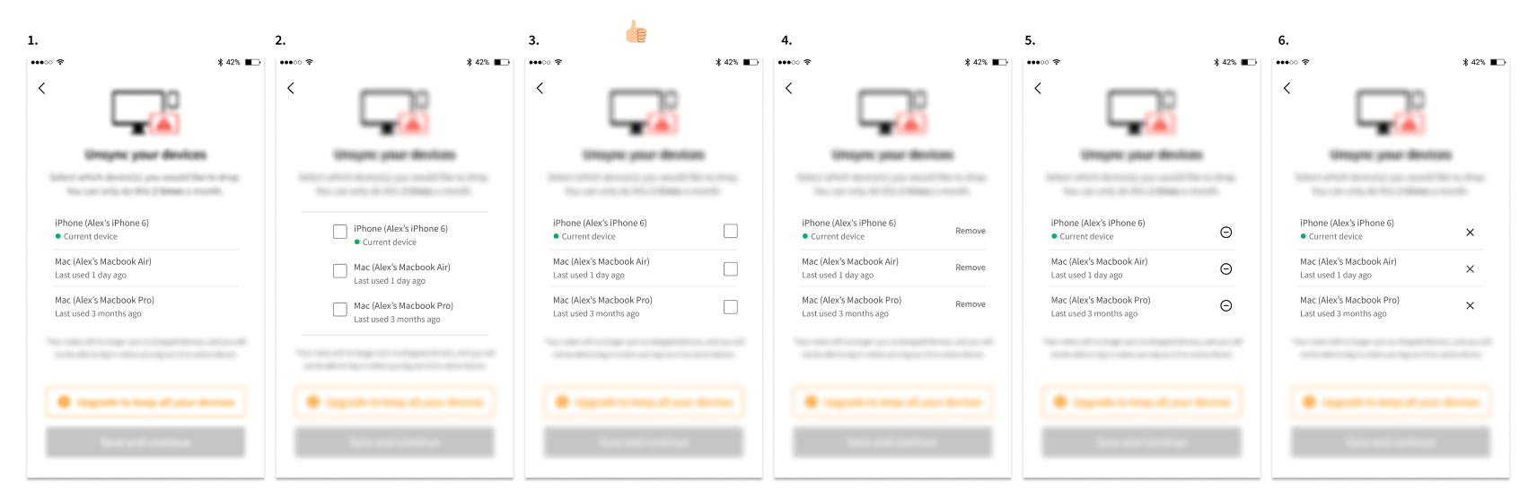
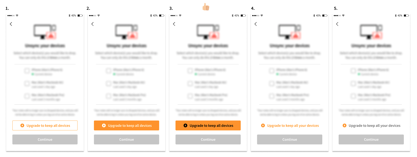
Step 2: Iterate on multi-select interaction
Explore different multi-select patterns, based on competitive analysis and usability best practices.
Step 3: Iterate on “Upgrade” CTA pattern
Explore different upgrade CTA styles that are more explicit than what was currently in production.
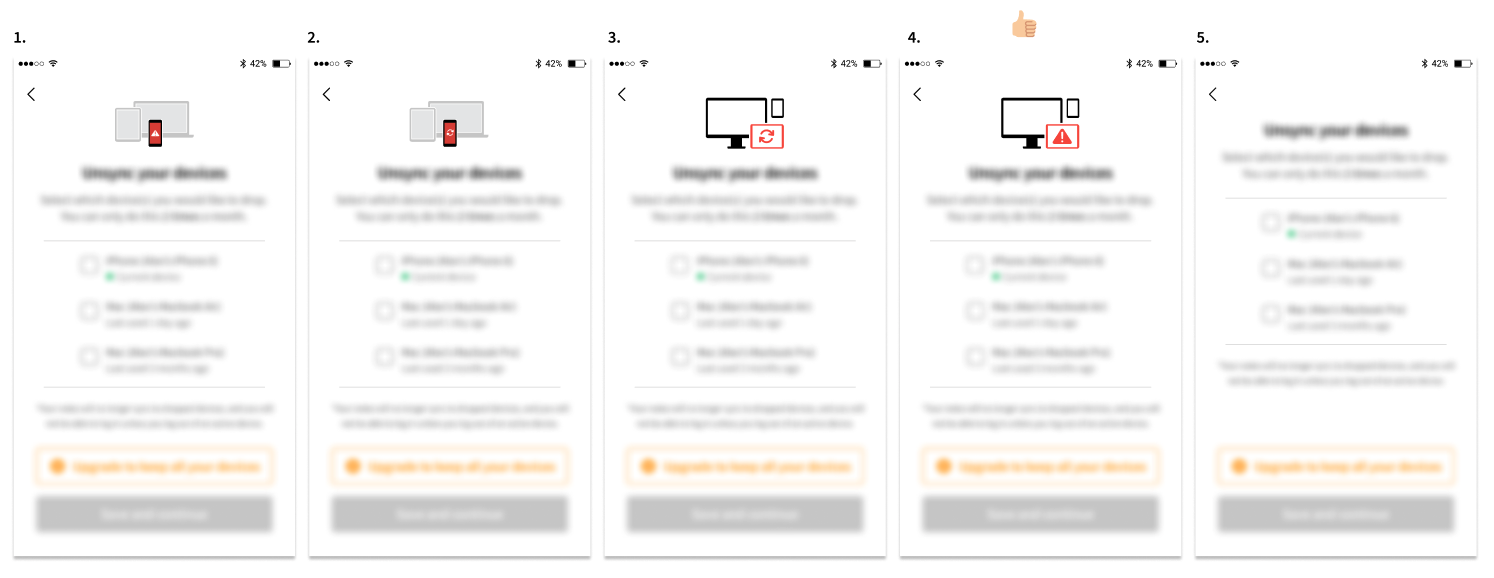
Step 4: Iterate on illustration
Explore different illustration that communicate being blocked on syncing another device.
Step 5: User test prototypes
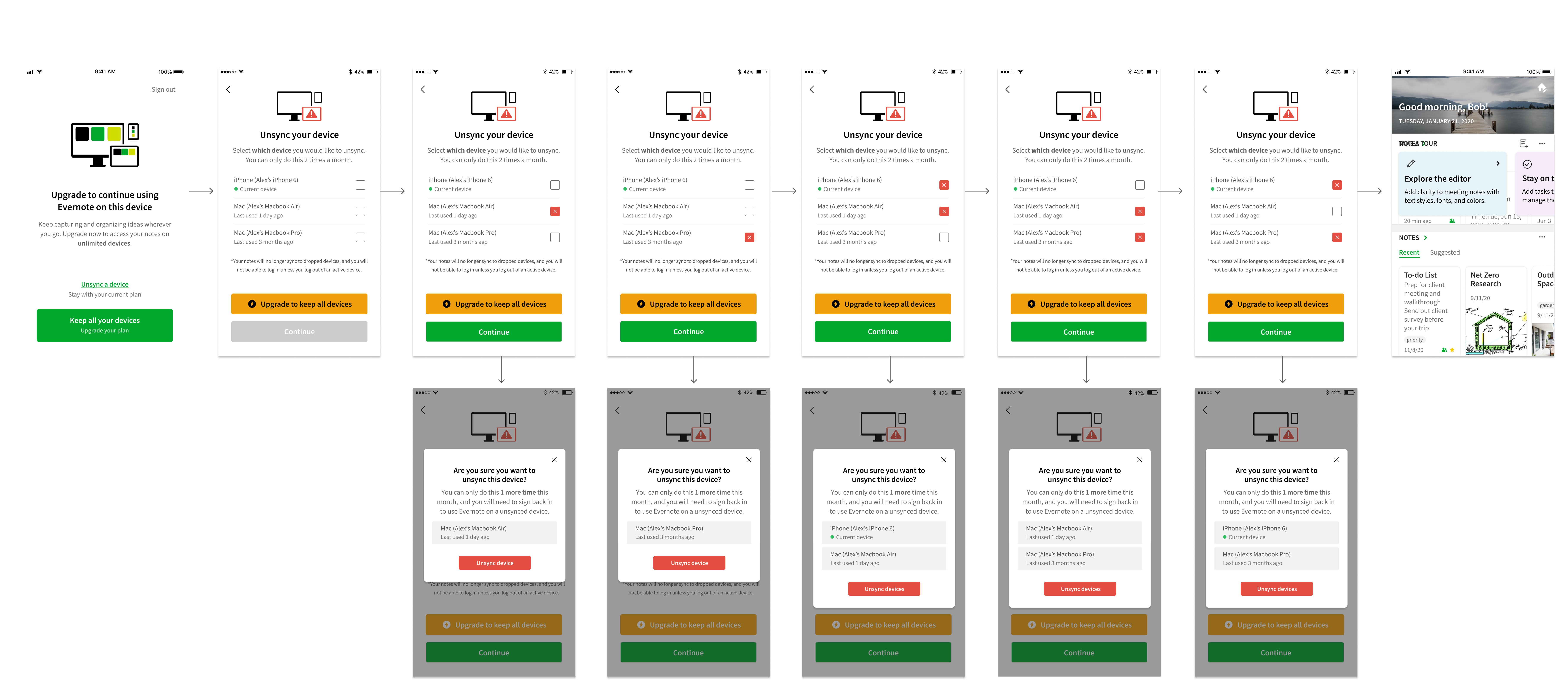
After narrowing down designs with team, I created a clickable prototype to user test against the old flow with Free users.
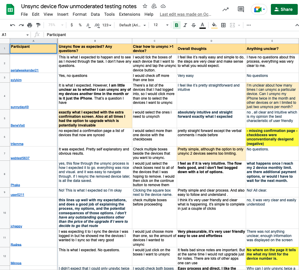
Step 6: Synthesize research
After conducting an unmoderated user test with 15 participants, I worked with the Researcher to synthesize the feedback to not only validate our hypothesis, but look for negative feedback that could help inform any design changes.
💰💰 Step 7: Final result 💰💰
By creating a better experience for users to unsync their devices, it gave them more confidence and trust in Evernote, which by proxy led to a 9% lift in conversion on this screen.
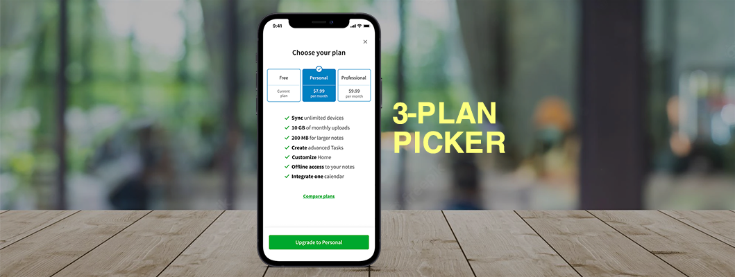
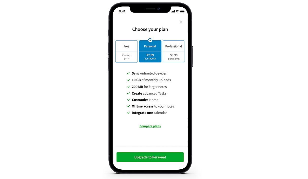
Problem: Users on the Free plan were churning when they had to choose between different plan options
After tapping on the upgrade button on Home, there was high user intent to learn more about the feature offerings for each plan. Unfortunately, 62% of users were bouncing out of the plan picker screen, and we wanted to know why.
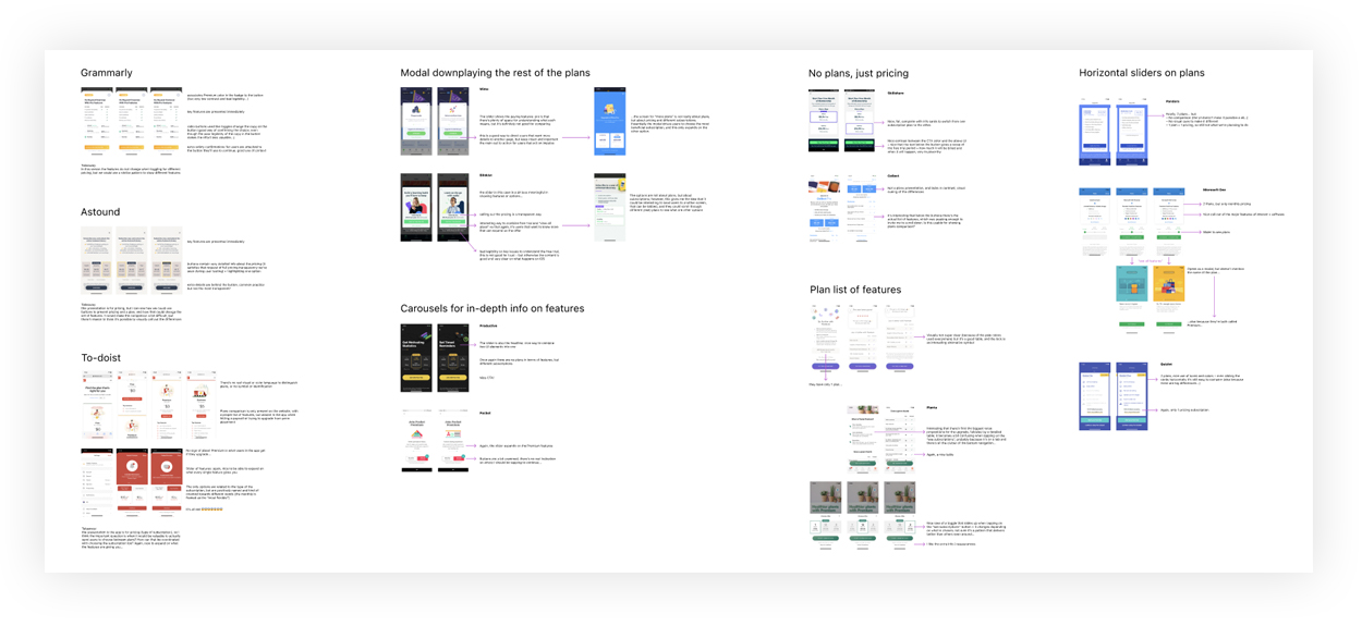
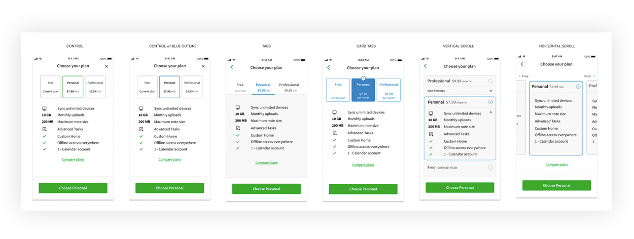
Step 1: Competitive analysis
Explore how other apps address this experience to find similar patterns we might apply to ours.
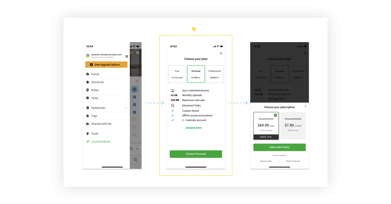
Step 2: Concepts for user testing
After identifying the best patterns from competitive analysis, I applied them to our style guide and created multiple designs to put in front of users to see which ones people liked the most. We conduct unmoderated user test, to have existing Free users and users who have never used Evernote go through the process of upgrading from a free to paid plan in our current flow.
Working with our Researcher, we not only had users go through our experience, but used similar experiences from other apps to see which one people preferred.
Step 3: Synthesize research
Combing through user feedback, we not only found a pattern that most people resonated with, but we found a pain point that we didn’t consider, which is how we were communicating the value of each plan in the body copy.
Because we were mix-and-matching icon patterns for each feature, most people had a hard time parsing through the value props, which frustrated them just enough to bounce out.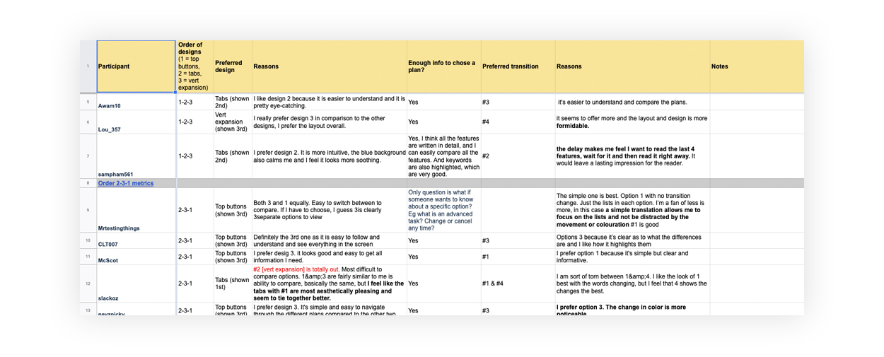
Step 4: Run experiment with new design
After narrowing down options in user testing, we ran this option in variant_B against control.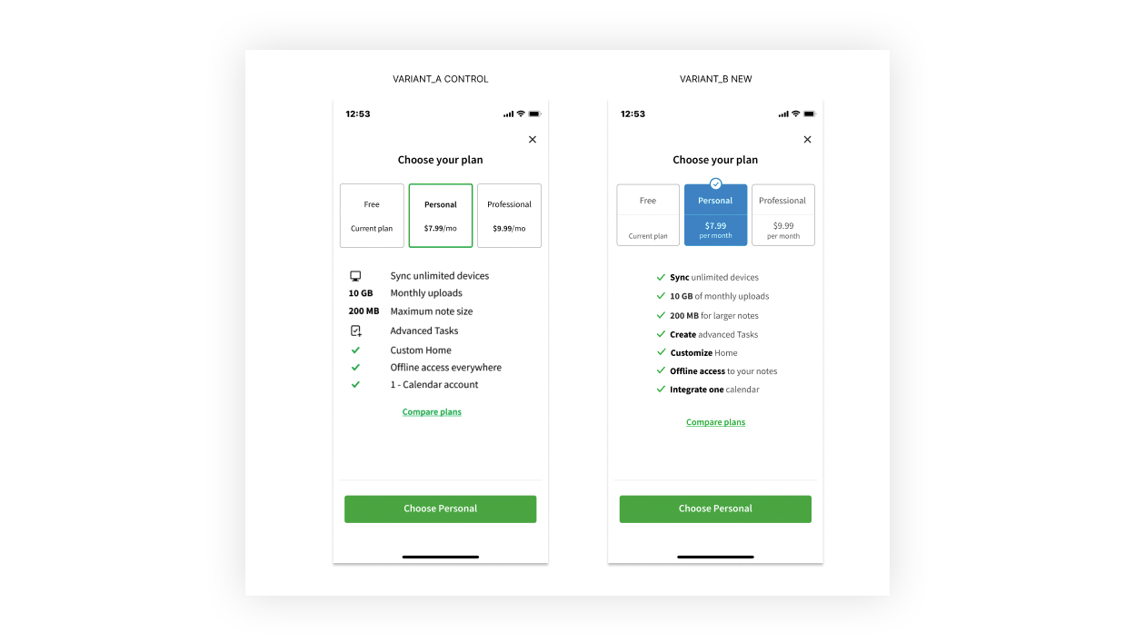
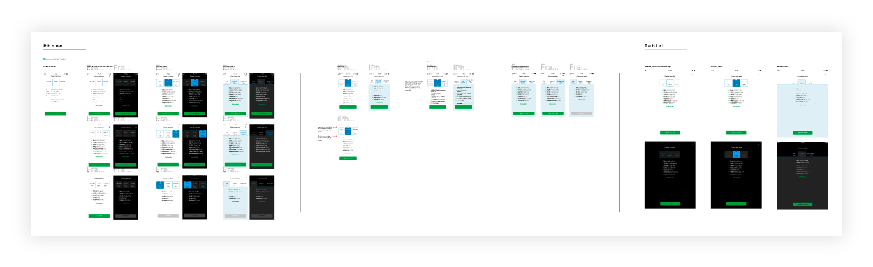
Step 5: Deliver to Dev
Specs cover localization, dark mode, small screen sizes, tablet, and links to prototypes. This was a great opportunity to get any feedback before they started implementation. After handoff, I worked closely with Devs and QA to ensure consistency in what was being built.
💰💰 Final result 💰💰
Variant B won over control by increasing conversion 8%, which resulted in +$375k in revenue.